Ok, on this, the day of one of my favorite things ever – the democratization of technology – let us have a serious, sober-ish conversation about this whole #StopDownloadableGuns / #Stop3DPrintedGuns hysteria by starting at the beginning and working forward.
- Is it legal to make your own firearms?
Absolutely (at the federal level). To put it the proper way, it has never been illegal to produce firearms for your own use. Do not sell it and do not make an illegal firearm (e.g. an SBR without an appropriate tax stamp), but otherwise? Knock yourself out.
And designs to build your own firearms at home have existed… basically since firearms have existed. Some of those designs are painfully-simple-yet-frighteningly-effective:
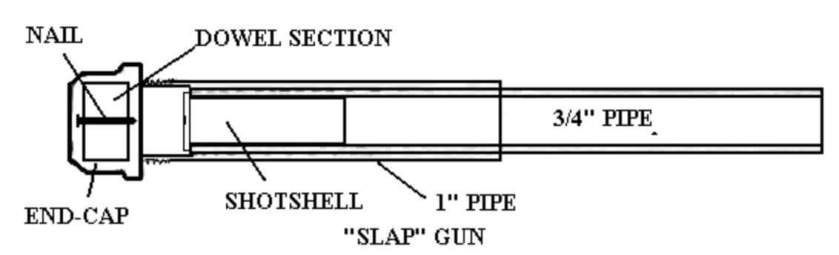
Others require a bit more knowledge and tools. And still others are literally commercially available.
All of those concepts take something that is not legally considered a firearm and turn it into something that is legally considered a firearm, at home, without registration or knowledge of anyone else. None of those firearms have to be serialized. None of those firearms are “traceable”. And, again, all of those designs have been available for literal decades. And making them is completely legal.
- It is legal to 3D print your own firearms now?
Yup. It is entirely legal to print a firearm with a plan you have on your local machine, right now, even before the whole “end of the world” thing today.
- So what’s the #StopDownloadableGuns fuss about?
Few years back, the State Department told an organization called Defense Distributed that if they continued to distribute firearms plans on the internet, they would be in violation of something called the International Traffic in Arms Regulations. ITAR is a pretty complicated topic in its own right, but it basically boiled down to DefDist – and its subsidiary project DefCad – being shut down. The thing is, the State Department edict exclusively applied to the distribution of the files, not the use of the files. Have them already? Knock yourself out. Share them online? Bad juju.
As of today, DefCad has been granted federal permission* to share the files as they see fit, and the predictable “gun control” organizations and extremists (but I repeat myself) are absolutely losing their minds.
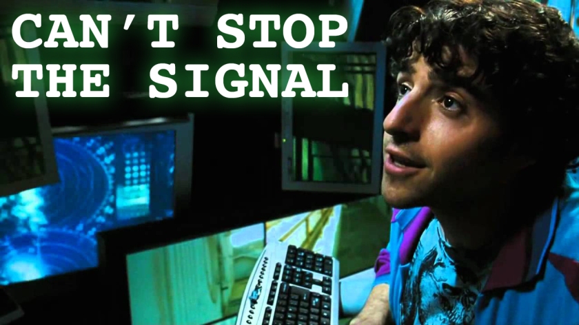
But here is the thing: the files are already out there. In lots of places. And they have been added to over the past few years. As the saying goes, “the internet views censorship as damage and routes around it.” Or, “you can’t stop the signal”.
So all this #StopDownloadableGuns / #Stop3DPrintedGuns nonsense about “letting horses out of the stable”? Yeah, they have been out for six long years, they have been multiplying like rabbits, and y’all done well and truly lost. Anywise. (And, again, this is even ignoring the firearm plans that only use parts from your local home improvement store and have been available for longer than most “gun control” extremists have been alive.)
- Can you entirely 3D print a firearm?
Not technically, and not legally. The technical problem is that firing pins are almost invariably made of metal for a reason – you have to set off that primer to, in turn, set off the powder. And plastic just does not have the strength to do that.
The legal problem is something no-joke called the Undetectable Firearms Act. This law is literally 30 years old, and requires at least 105g of steel in any firearm ever produced, anywhere – even at home. This applies to 3D printed firearms.
Remember that scene in Die Hard 2 about the mythical Glock 7 that was made entirely out of porcelain or something? Yeah, the Undetectable Firearms Act is older than that, rendering this whole #StopDownloadableGuns / #Stop3DPrintedGuns hysteria ludicrous.
- Can you mostly 3D print a firearm?
Short of the firing pin and enough other steel to be legal, sure. And it is good for… about a maximum of ten rounds, from what I have seen so far, and marginally accurate at five yards, if that. They are proofs of concepts, nothing more.
Well, for example, AR-15 lowers do not have a significant amount of force or temperature applied to them at any given time. Given appropriate modifications, you could totally print a lower that is good for 500+ rounds, depending on materials.

And people have been, again, for literally years. The 3D-printed AR lower is kind of the holy grail of 3D printed firearm hobbyists, and the last iteration I saw was… solid. Drop a lower parts kit in it, an upper on it, and a stock, and it works, for a time.
- So what’s the point of 3D printing firearms?
Remember “democratization of technology”. The USSR abjectly feared mimeographs and other copy machines simply because they knew they could not control the flow of information – and propaganda was, and still is, essential for socialism to “work”.
- So, hold on, is this a Second Amendment issue or a First Amendment issue?
The end product is definitely protected by the Second Amendment, but the specific situation of whether or not the federal government – or any government – can control the distribution of information is totally a First Amendment issue. The #Stop3DPrintedGuns folks are literally calling on the government to control what information you can and cannot read. This is no different than if the “gun control” extremists were trying to convince the government to burn all of a specific technical journal.
Yes, #StopDownloadableGuns is morally and logically equivalent to book burning. It is censorship, pure and simple, but even a step beyond simple censorship because they are actively trying to destroy the information.

And the control of information never works, even if the government is involved. The case of United States v. Progressive Inc. is probably the closest parallel to the current situation, and it pertained to publishing plans to a no-joke nuclear weapon. And, guess what? The government gave up the case. The hilarious story of the RSA “munitions” t-shirt is another example where the FedGov lost.
3D printers are the modern day Gutenberg movable type press, but instead of democratizing knowledge, they democratize power. 3D printing firearms, while still in its infancy today, puts the means for people to defend themselves squarely in the hands of the people – where it always should have belonged in the first place. How? The ability to download a file and push a button to produce a “functional” – for various definitions of the word – firearm removes licensing and registration and confiscation and all other forms of “gun control” from the table. This is why #StopDownloadableGuns / #Stop3DPrintedGuns ninnies fear it so.
And that is the ultimate irony.
These folks style themselves as the “Resistance” against the current administration, but not only are they wanting to give President Trump more power than he Constitutionally should have, but they want to deny We, The People another means of defending ourselves.
These are frequently – if not invariably – the same people who decry our current President as “literally Hitler”, and they want to remove a rather significant means for the public to defend themselves from being thrown in cattle cars and extermination camps. How ludicrous is that?
(* – Well, the State Department granted them permission, but US District Judge Robert Lasnik, who appears to be more interested in signaling his virtue than obeying the Constitution, granted a temporary restraining order against DefCad. Not even Judge Lasnik can stop the signal, though, as Code is Free Speech is adequately demonstrating.)